Big news: We’ve launched a new-and-improved look and logo over here at Comeet!
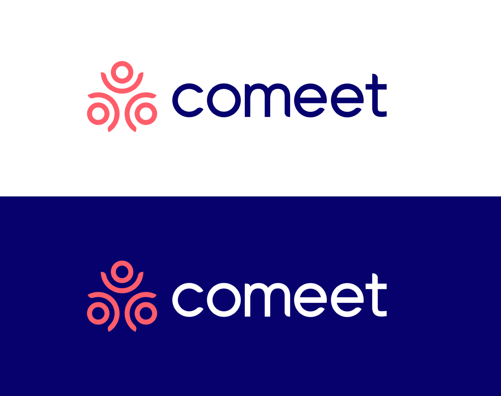
We’ve updated our logo, color scheme, and imagery across our website and the Comeet platform. We couldn’t be happier with the results. You’ll see that it’s friendlier, more confident, and more motivating — just like Comeet.
(It’s important to note for our customers: Nothing changes in Comeet’s core functionality; your experience will remain the same.)
Why the makeover? We wanted our brand to better reflect:
- Our mission to power exceptional hiring experiences for everyone involved in the hiring process
- Our belief that collaborative hiring is what achieves that mission
Comeet brings together all the key players in the hiring process: The recruiters, the hiring managers, and the candidates. Each of these parties deserve a hiring experience without friction — one that is joyful, transparent, and affirming. That’s what ultimately builts winning teams!
The Comeet logo needs to celebrate the magic that is collaborative hiring. It’s the visual symbol that represents Comeet and all we stand for — our logo refresh needed to be perfect.
Here’s more on our hard work to update the Comeet logo.
Refreshing the Comeet Logo
Our new logo’s celebratory presence and inclusive shape is a symbol of what Comeet does best: Bring people together to create winning teams.
![]()
A Voice to Recruiters, Hiring Managers, and Candidates
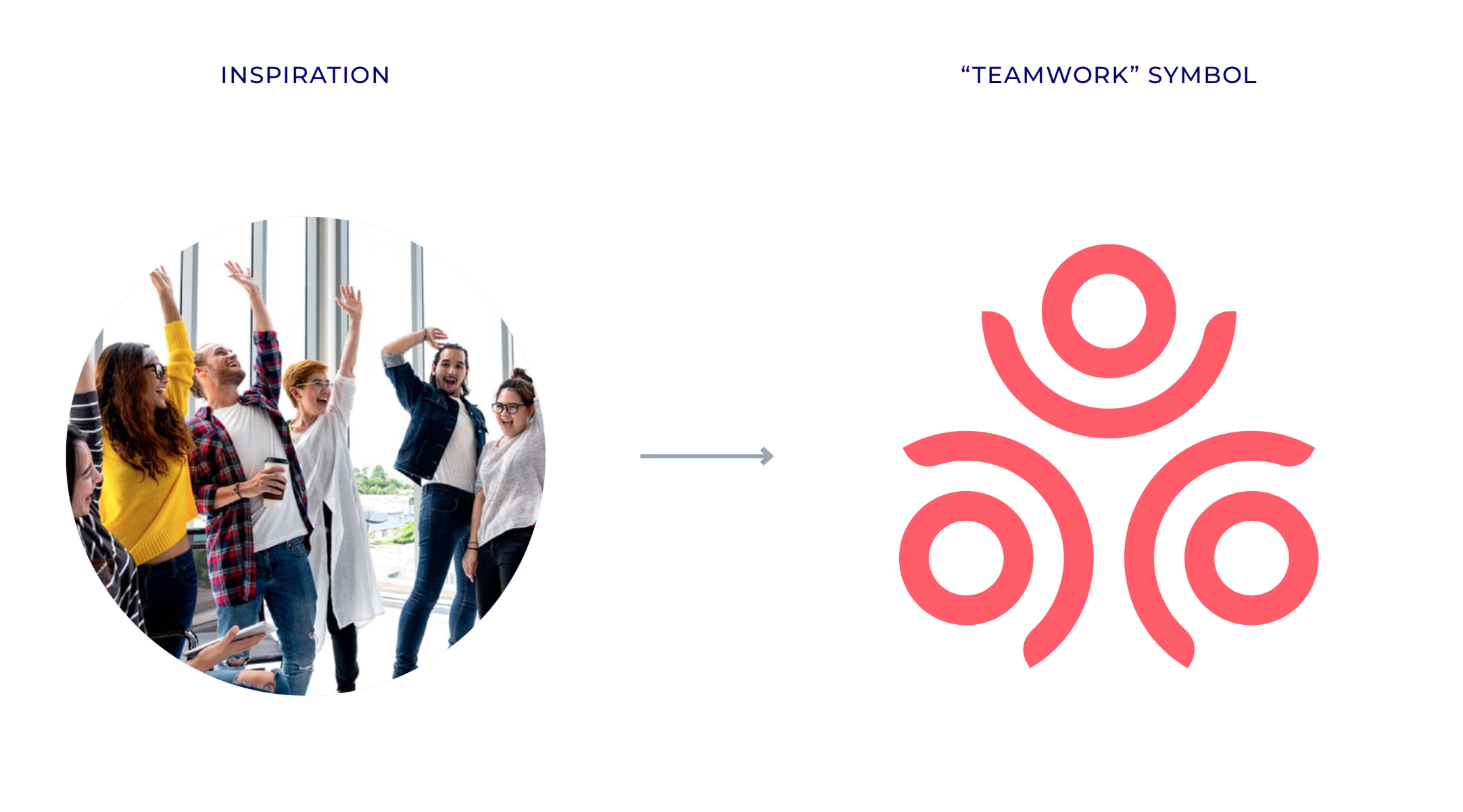
Our new Comeet logo is a visual expression of the concept of collaborative hiring. A hiring process involves so many different parties. When recruiters, candidates, and hiring managers are in sync and communicating smoothly, the hiring process can work at its best.
The new logo shines light on that teamwork between recruiters, hiring managers, and candidates. So, the 3 circular elements of the logo each represent one of those 3 parties.
Recognizing Teamwork
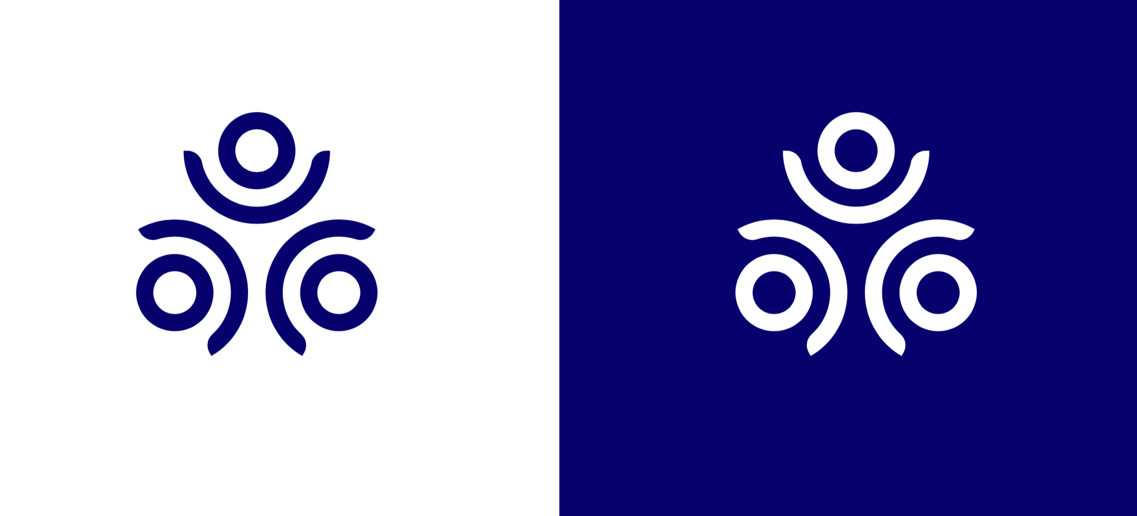
Just like those 3 parties come together to form a greater whole, we wanted the 3 circular elements to form a cohesive symbol. You’ll see there’s no hierarchy between them — the recruiter, hiring manager, and candidate each need to work in partnership.
Celebrating the Hiring Experience
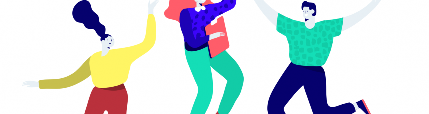
The Comeet brand is celebratory, motivating, and positive — just like the hiring process, when it’s excelling. We wanted our logo to reflect that mood. When the 3 circular elements are combined, the new symbol alludes to a joyful person raising their arms.
Balanced Colors
We updated our brand colors to better reflect our motivating personality and our unshakeable focus on serving our clients the best possible experience. Our primary colors, navy and coral, hit both notes. They’re friendly and steady, regardless of how we use them in our logo variations.
Special thanks goes to Felicia Stingone and Janine Silvera of Chief Marketing Partners, Debby Noy and Johnnie Mack on the Comeet team, and Motto for their help in this brand refresh.
We’d love to hear from you. If you have any questions or feedback on what has changed, please contact us at hello@comeet.co. Thanks for being a part of our journey to elevate the hiring experience for all.